
Pulse+IT
- Market-Research & Discovery
- Branding & Identity update
- Web Design (UI/UX)
- Custom WordPress Development
- Application UX/UI Design
- Migrating different security permission for users
- Setting up subscriptions
Portfolio
Pulse+IT
Project Brief
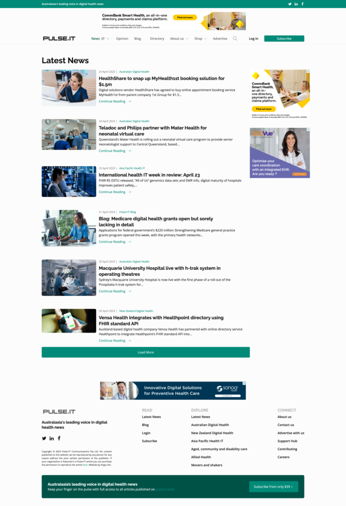
The existing Pulse+IT website had reached a stage where both its visual design and underlying structure no longer reflected the authority or credibility of the publication. As the platform had evolved over time, the site’s presentation and usability had fallen behind the expectations of a modern national audience.
The ageing design limited content discovery and made it harder for readers to navigate a growing volume of articles and industry news. While the publication itself had continued to grow, the website was no longer effectively supporting engagement or guiding users through key sections.
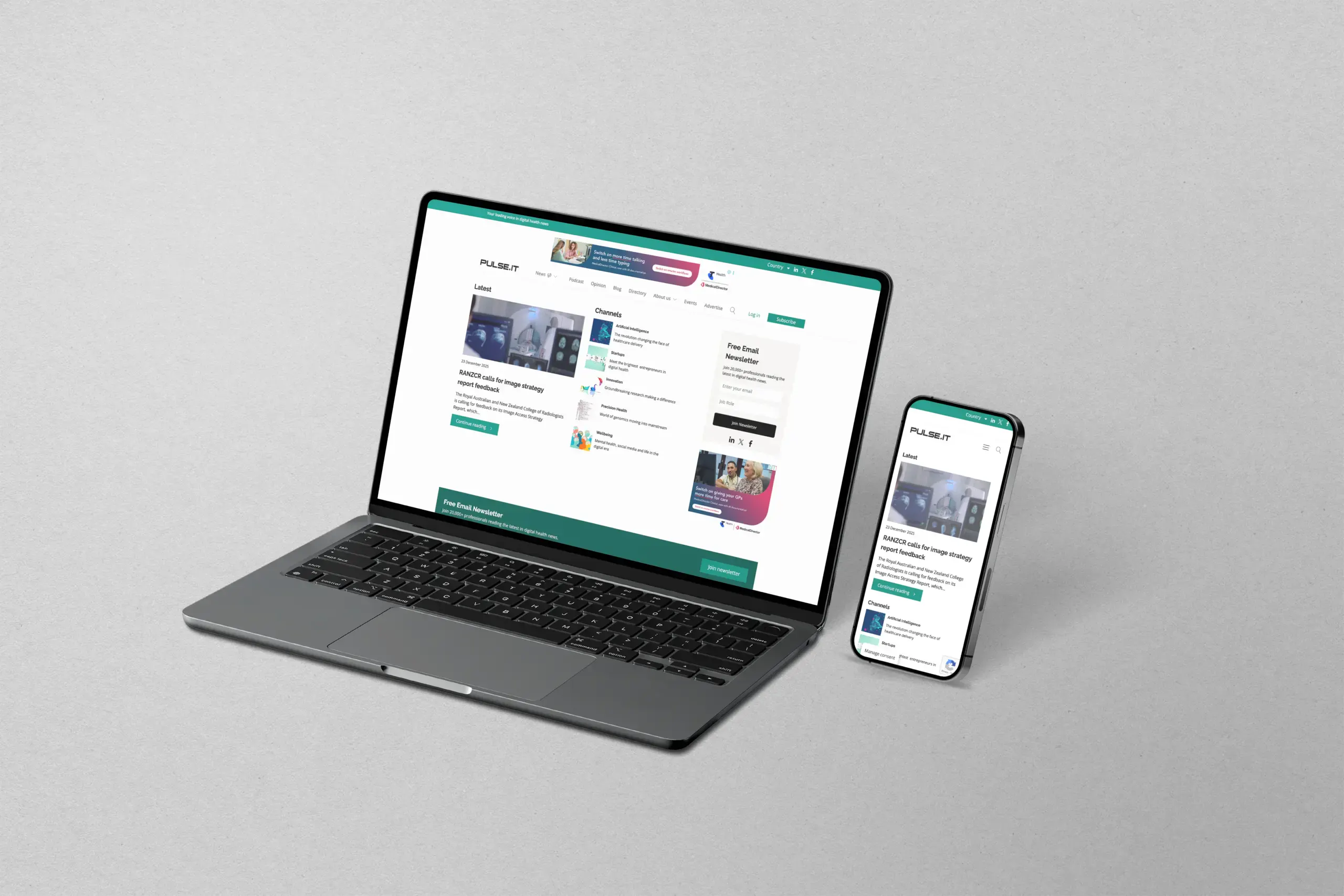
A rebuild was required to modernise the overall experience, improve readability, and introduce a clearer content hierarchy. The objective was not only to refresh the look of the site, but to implement a structure that could support ongoing publishing demands and future expansion without introducing unnecessary complexity.
The project focused on delivering a clean, flexible WordPress build that aligned with the publication’s national presence, while ensuring the platform could scale alongside Pulse+IT’s continued growth in the healthcare sector.
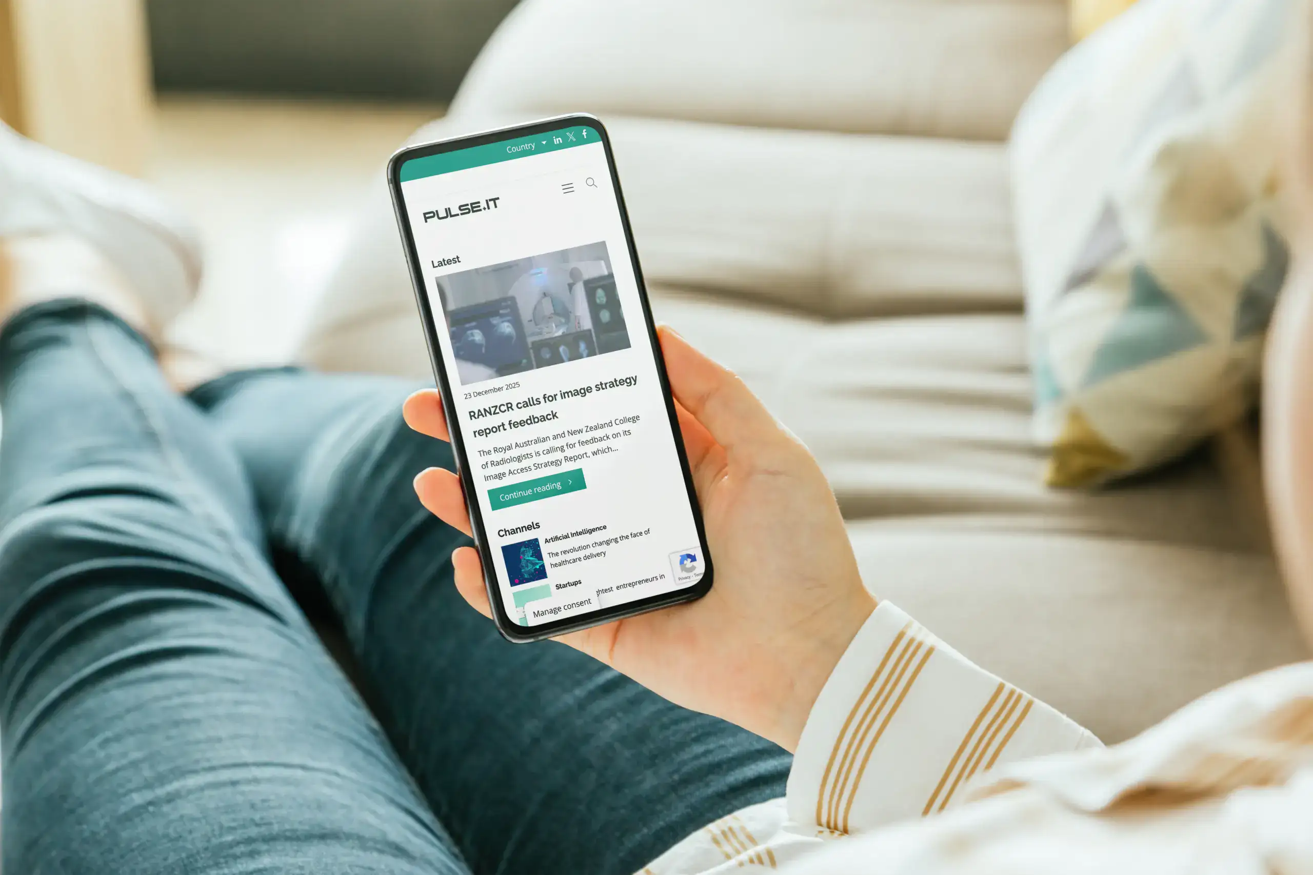
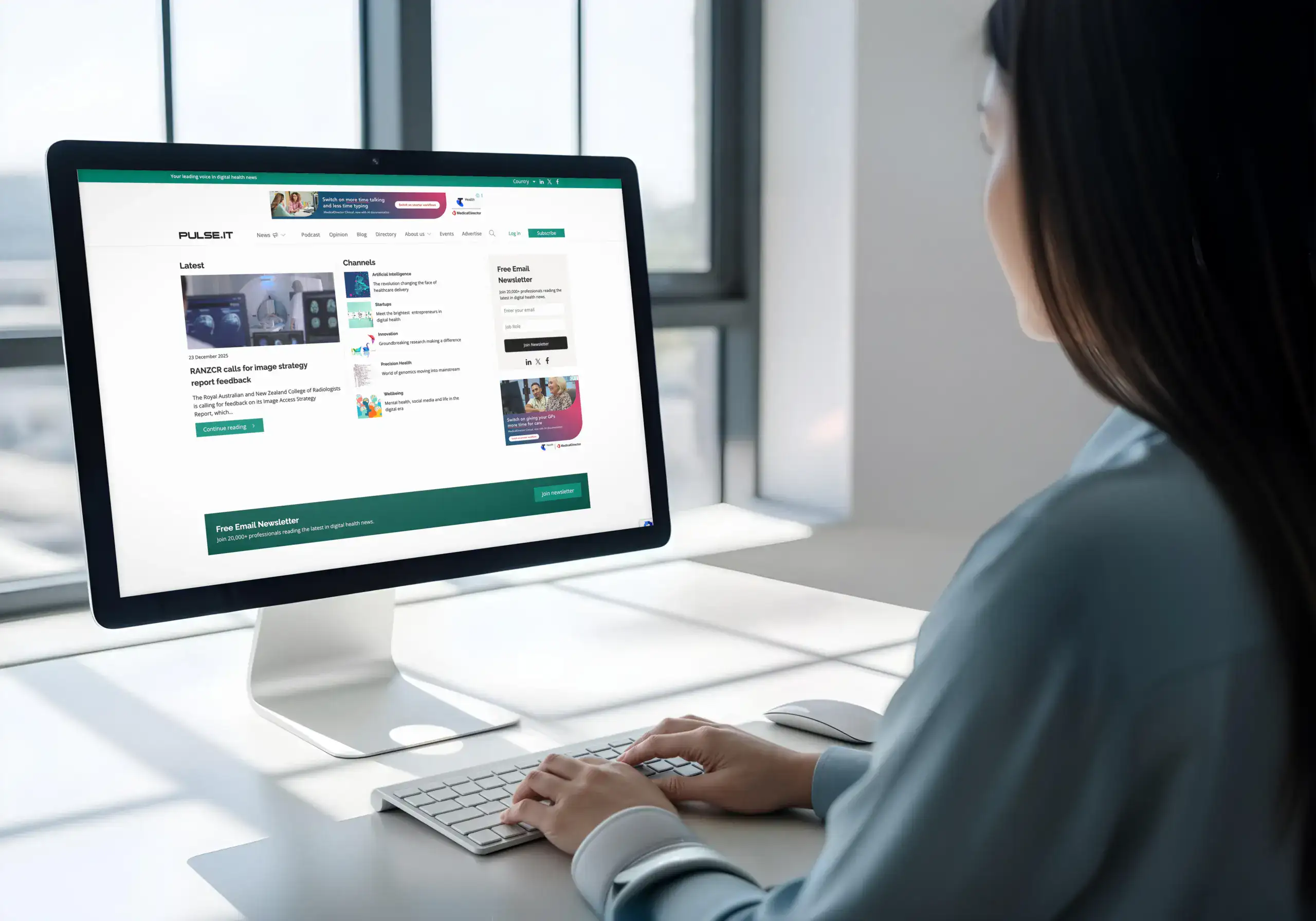
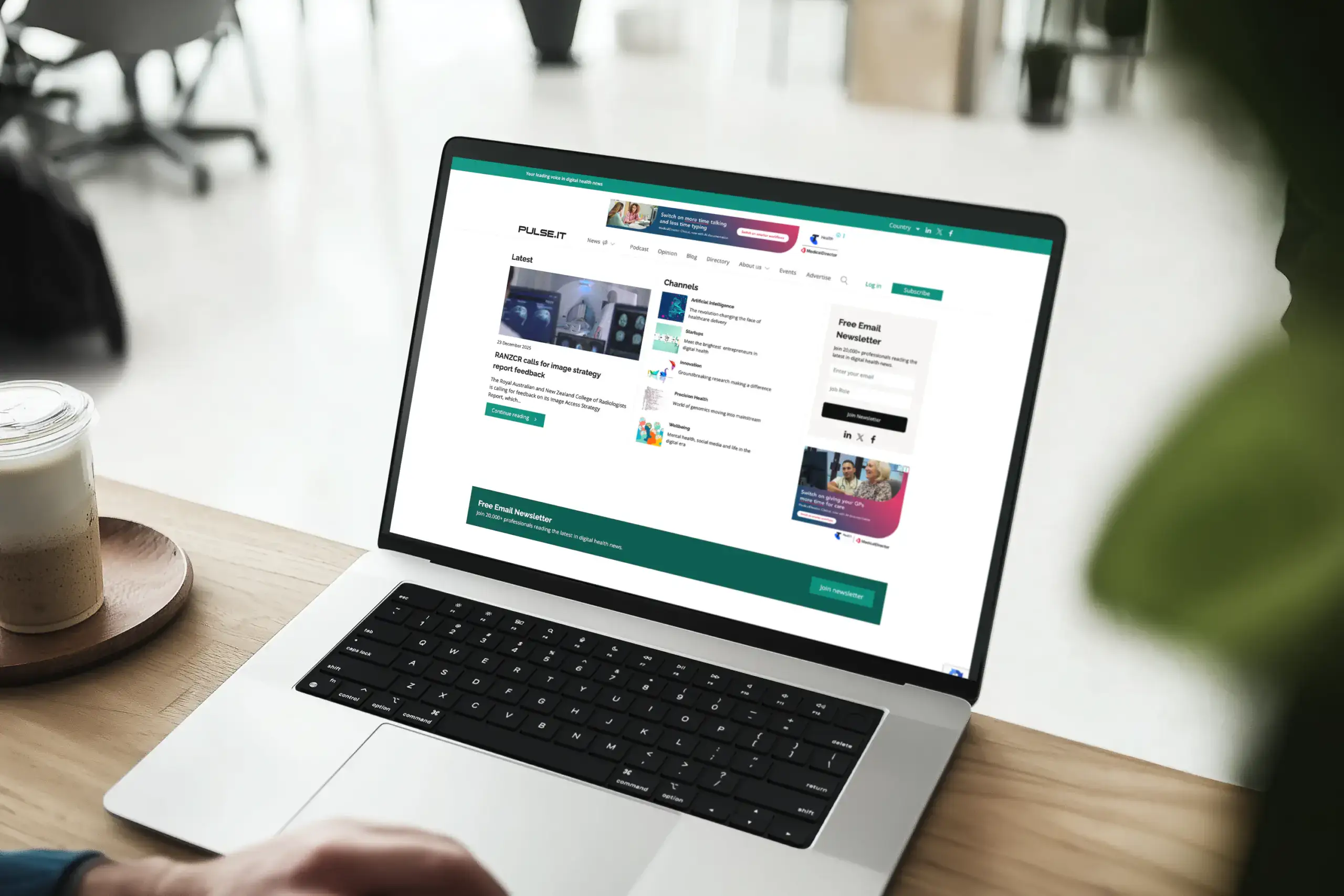
Structured for Clarity and Readability
Outcomes
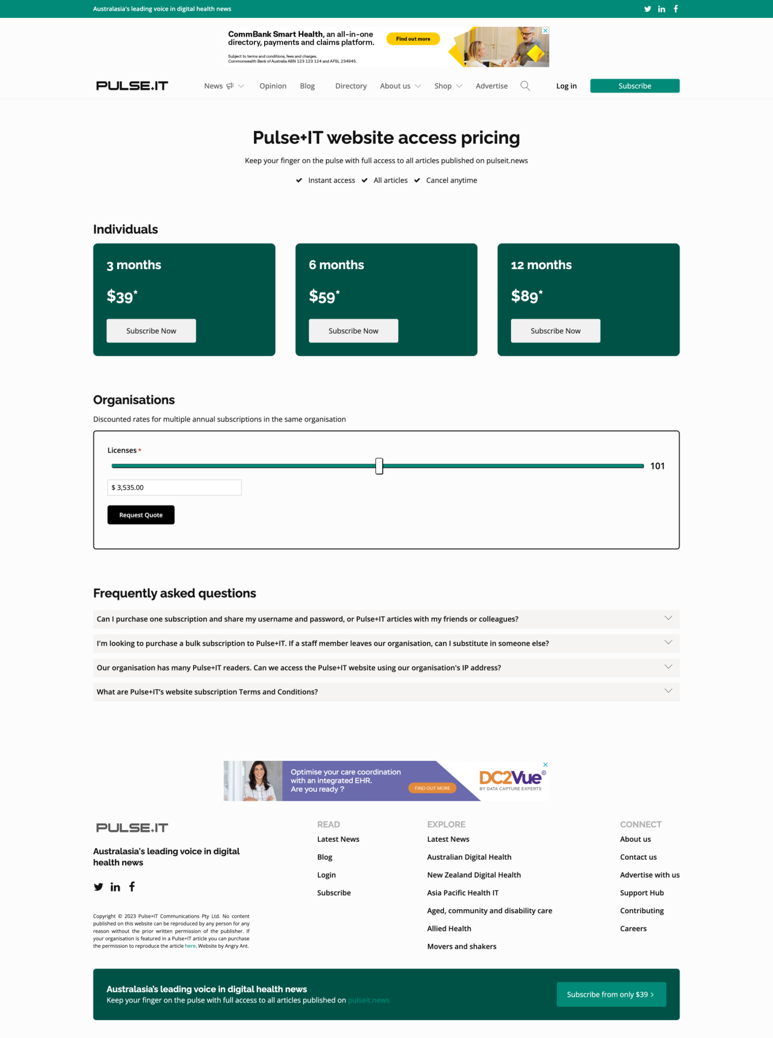
Membership Selection
An easier clearer selection of the cost and how to subscribe and the benefits made signing up more attractive.
Branding
We reviewed their old branding moving from black and orange to a medical green and black provided a more contemporary feel to the site.
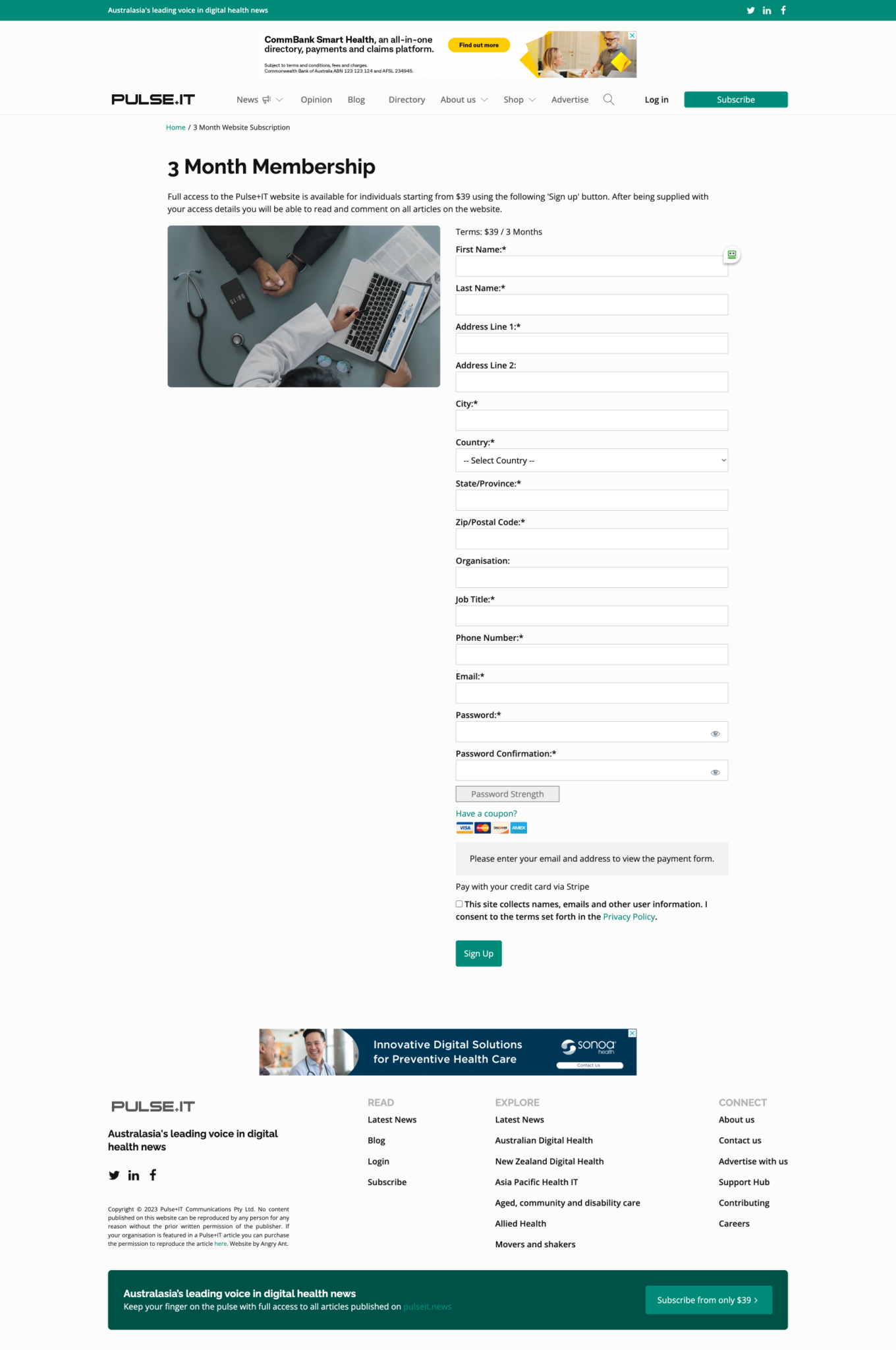
Custom Signup pages from MemberPress
We used custom fields to maintain data which was vital to billing and the management of subscribers.
Categorised Articles
With thousands of articles, challenges such as migrating these with new updated internal links needed to be maintained.
Gallery
Let's get serious about strategy
If your website doesn't talk to your customers then it's not getting you the leads you deserve. No pressure, no obligation but if you just ant to talk through what we could do for you give us a call.